We gave two of our designers a project to come up with some ideas for a family room. No limitations on color, here is what they each came up with.
Option 1: Deeper, richer earthy tones set the mood to warm and inviting.
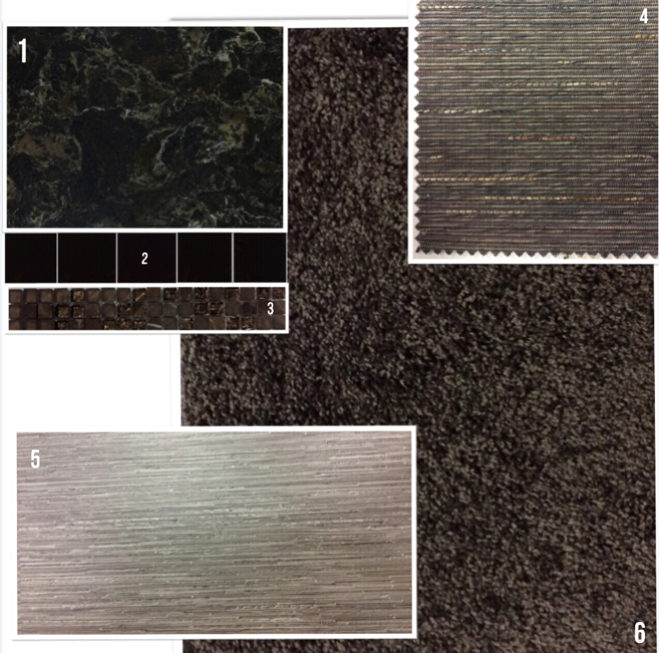
1. Cambria color Laneshaw …. could be used for a bar top, fireplace face or hearth, the top of a built in bookcase, or even a recessed ledge/ niche.
2. Glass tile- this 4″ x 4″ black glossy tile would be a stunning backsplash with the Cambria Laneshaw or on the fireplace face.
3. Mosaic tile- you can incorporate this beautiful mosaic glass and stone mix mosaic tile in the bar backsplash or use it on the fireplace face.
4. Blinds- for your window covering needs this woven blind from Alta offers a casual and earthy look that is perfect for this type of space.
5. LVT- use this linear striated pattern on the bar floor, or in front of a patio door for a chic and modern look. (style: Karndean Loose Lay color Pennsylvania)
6. Carpet- Plush and soft, this frieze texture carpet is rich and inviting. (style: Tuftex I Got You color Deep Brown)
Option 2: Lighter neutrals of creamy beiges and subtle taupes offer a hint of sophistication and grace to this color pallet while still being comfortable and cozy.
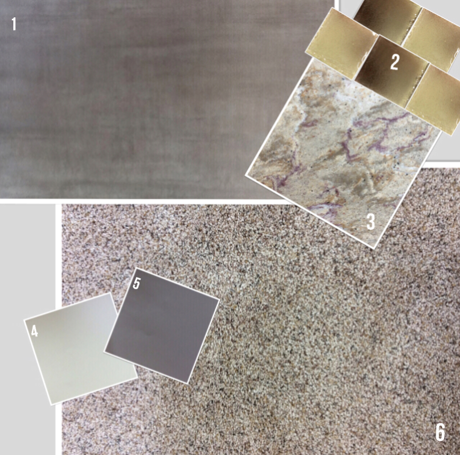
1. Floor tile: Soft taupe tones in a subtle washed effect. This tile is a great option for a bar floor, in front of a patio door or it can even be used as a fireplace face or hearth tile. (style: Modern Olive 12 x 24)
2. Glass tile: These creamy beige tones are stunning against the Cambria countertop and could be used as a backsplash.
3. Cambria color Nevern– is a brand new color! There are stunning amethyst tones running throughout against a backdrop of neutral tones for just a hint of color.
4. Paint: Sherwin Williams SW6273 Nouvelle White
5. Paint: Sherwin Williams SW6277 Special Gray
6. Carpet: This premium soft carpet feels amazing underfoot! Mohawk Smartstrand Silk style Healing Touch color Driftwood
We would love to hear your opinion- do you prefer the darker richer tones of option 1 or the lighter creamy beige and gray neutrals of option 2?
